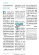
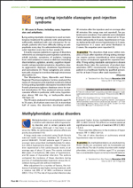
Prescrire International has been redesigned, beginning with the February 2017 issue, and following the redesign of the French edition La revue Prescrire in late 2016.
Subscribers have hailed Prescrire's new design as a welcome change and a considerable improvement over the former page layout.
BEFORE
 |
AFTER
 |
BEFORE
 |
AFTER
 |
Over the years, since the first edition of La revue Prescrire in 1981, the independent French journal has added more and more pages, sections, articles and information. To the point where some readers began to find it a bit too dry, too dense or too complicated. The English edition, launched in 1992, has also grown considerably in content, and suffered from the same graphic overload.
The new design features a completely new page layout, to open up the content and make it easier to read, on paper as well as on the screens of all the various devices with which the journal is now compatible.
These changes are designed to make the content more accessible. And to make subscribers want to read it. A page layout that is brighter and more balanced, while still rising to the challenge of delivering the same quantity of information every year. Judicious use of colour to enhance the reading experience, and to facilitate the choice between an in-depth read or a quick skim of the contents.
Prescrire and Prescrire International are changing... but they will also remain the same. To best serve subscribers' needs for quality information and continuing education.
©Prescrire 1 February 2017
> Learn more about Prescrire International
> Subscribe
